PACKAGING | BRANDING
Lone Star Wine Co.
Label Design
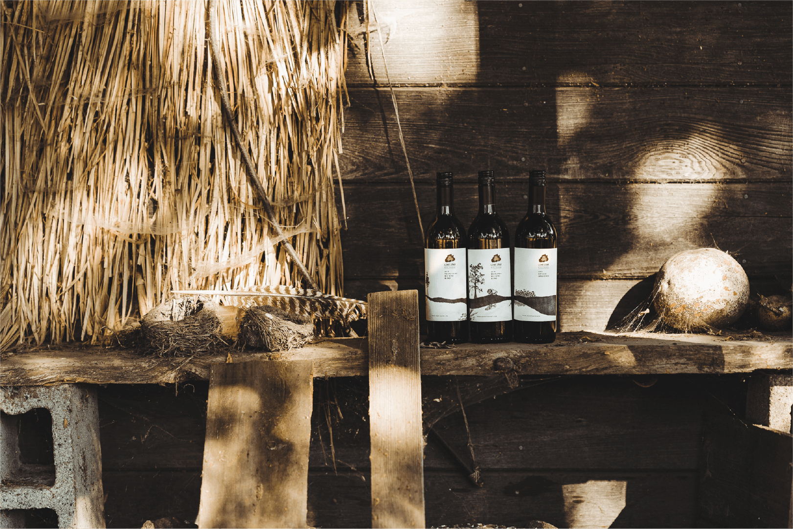
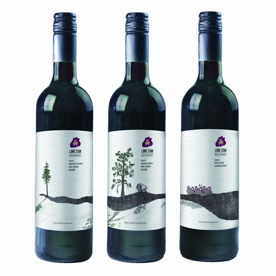
Texas High Plains AVA Collection
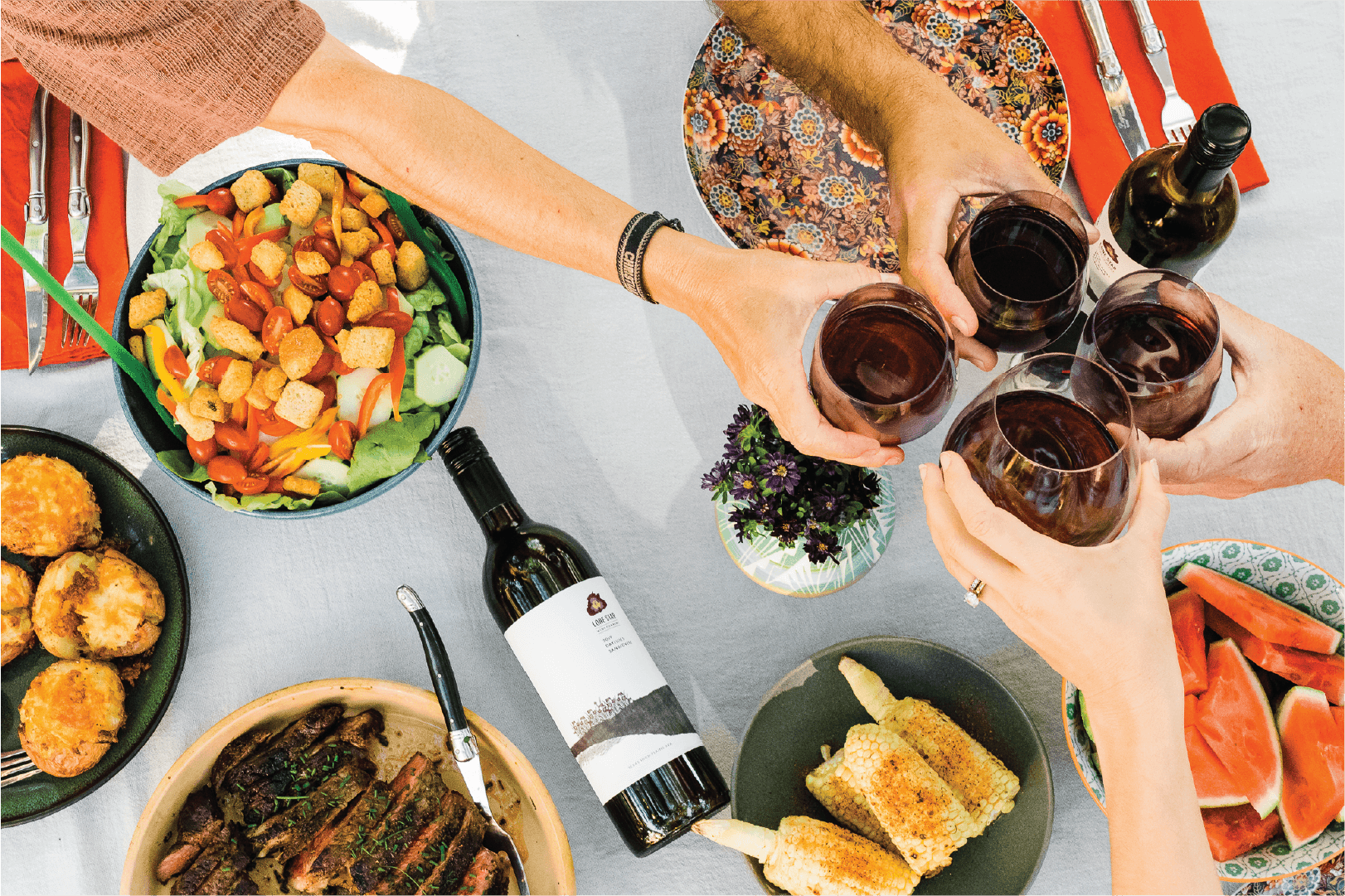
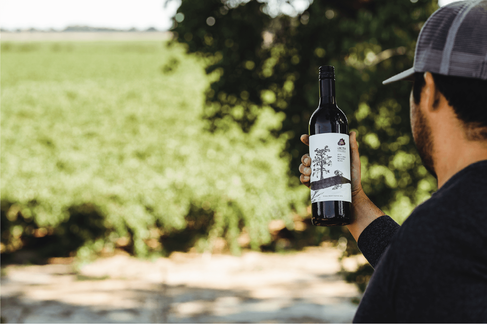
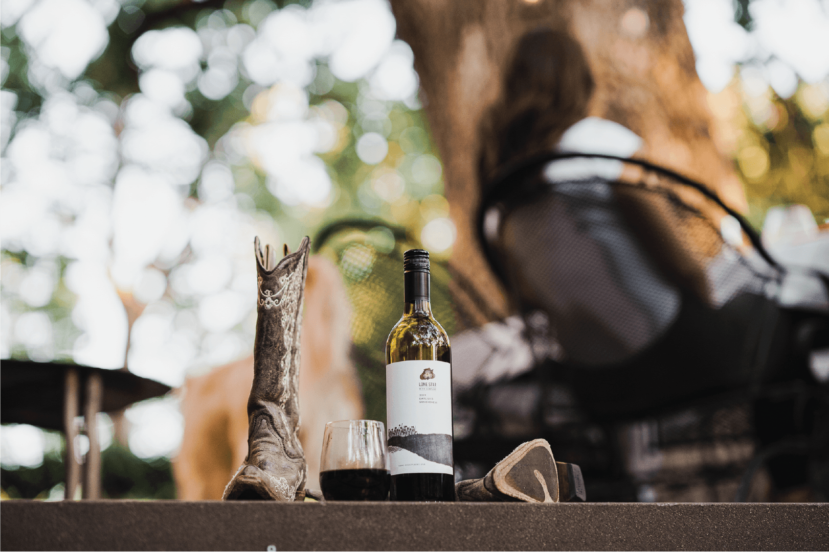
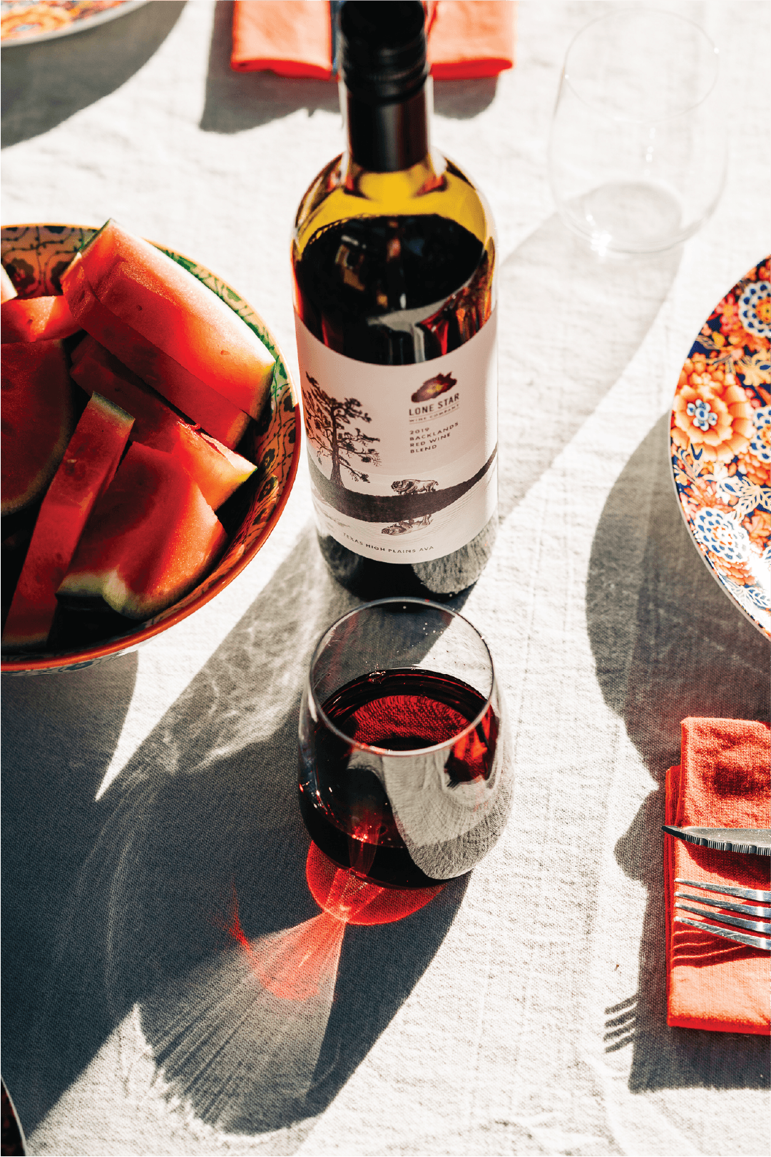
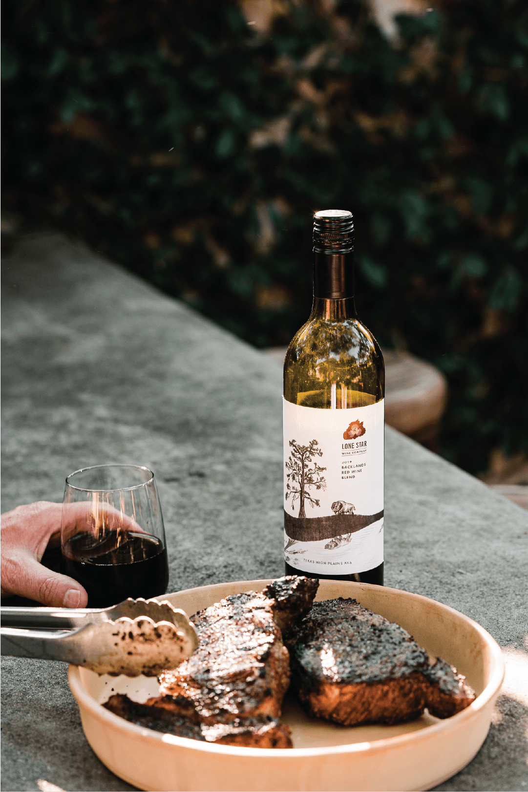
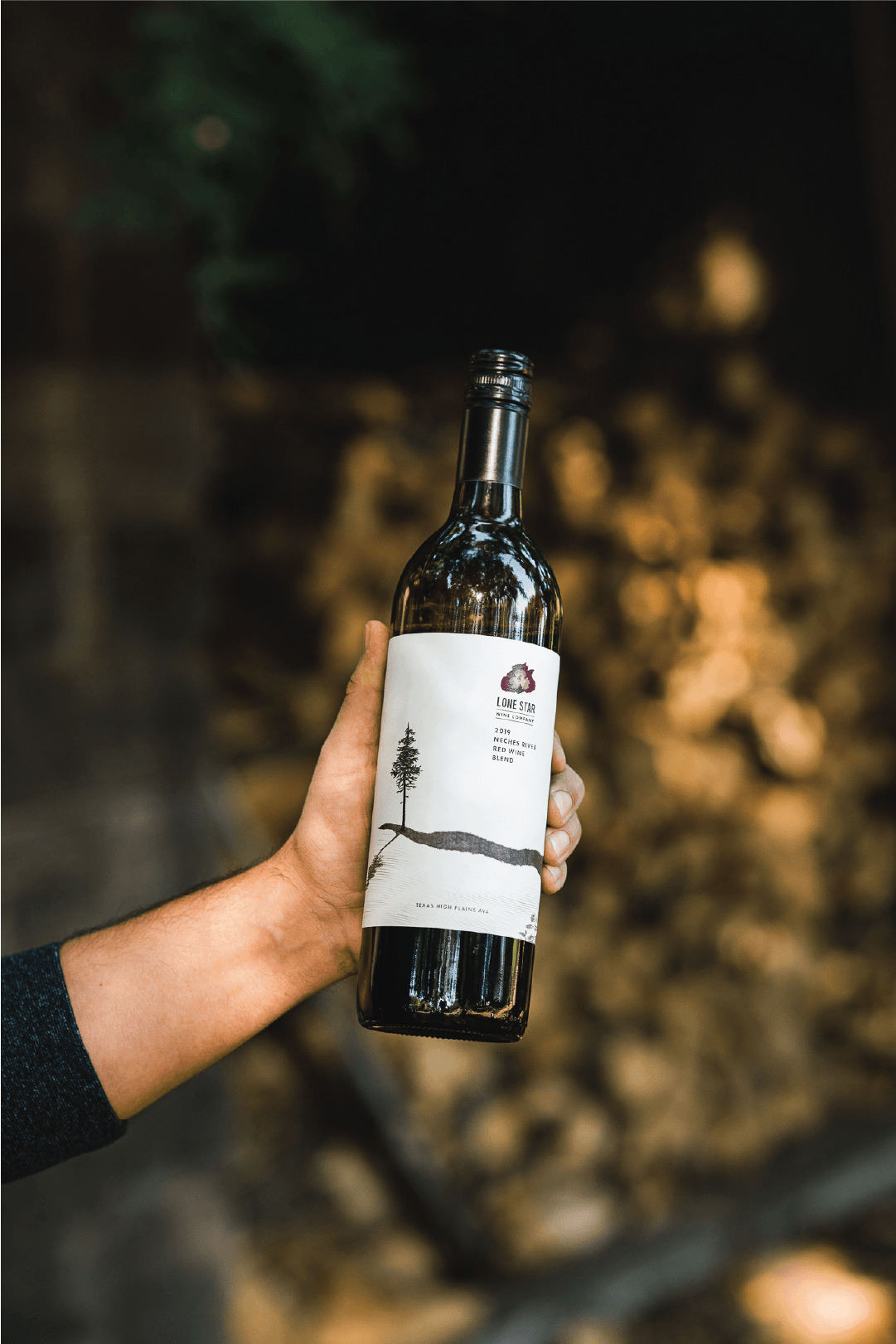
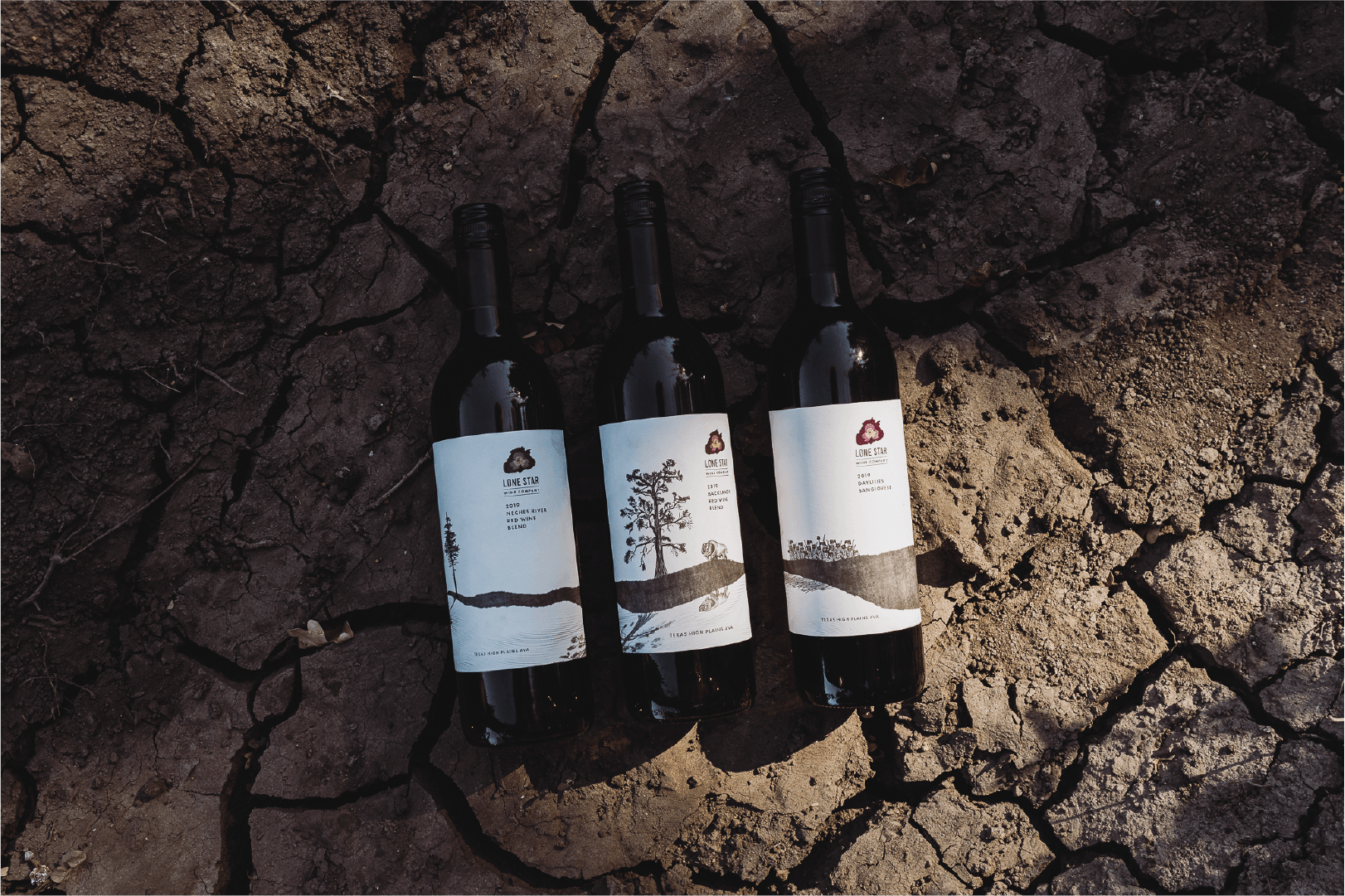
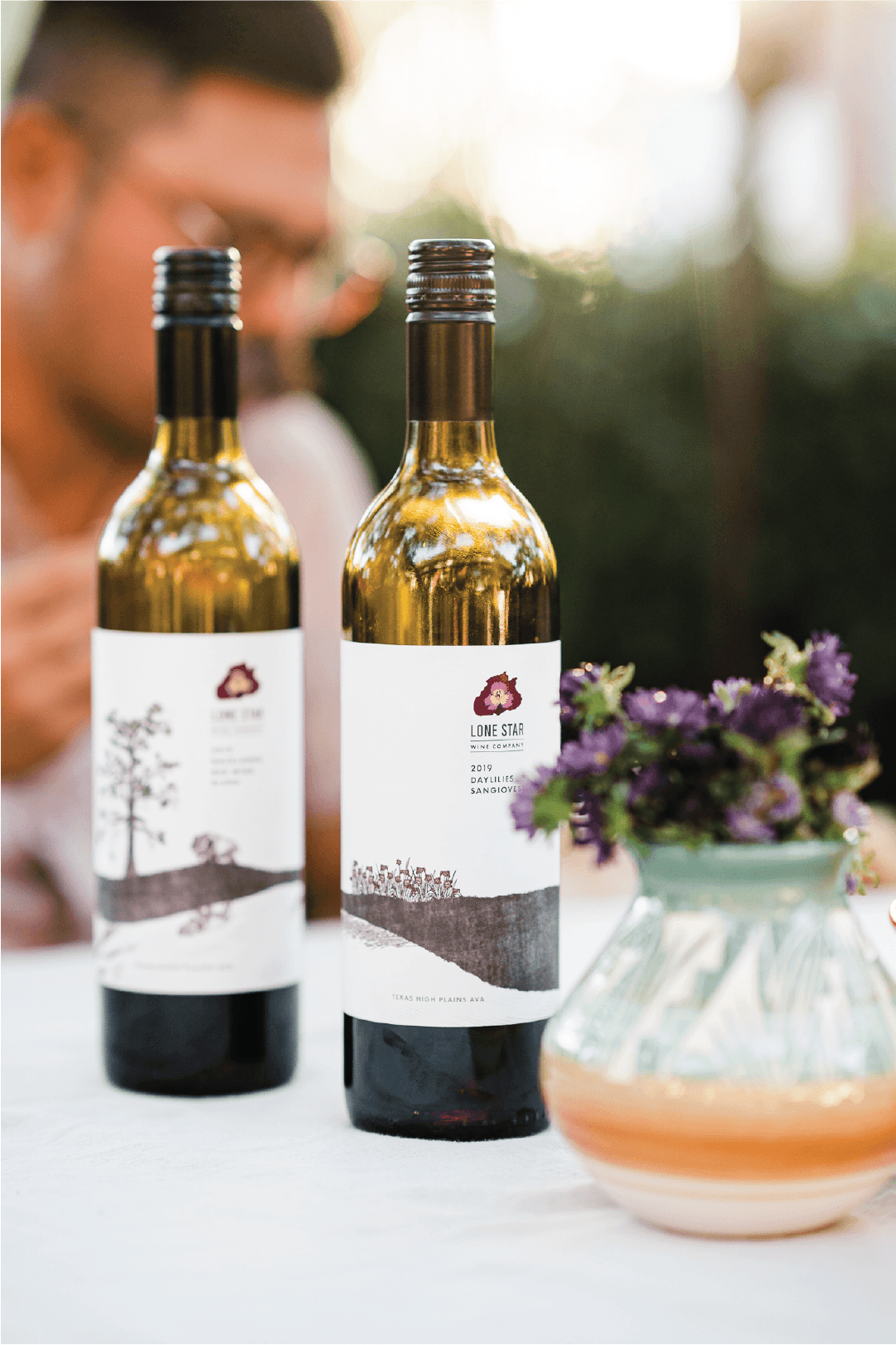
The Lone Star Wine Company labels are a tribute to the rugged beauty and quiet resilience of the Texas High Plains. Designed with a minimalist aesthetic, each label features finely detailed, hand-drawn landscapes native to the region — lone trees, wildflowers, and rolling plains — evoking a sense of solitude, heritage, and timelessness.
A restrained black-and-white illustration style grounds each bottle in the authenticity of the land, while a pop of color in the Lone Star Wine Co. emblem — a stylized Texas wildflower — provides a modern, vibrant accent. Clean typography, careful use of white space, and subtle textural details on the label paper reinforce the premium yet approachable character of the brand.
Each varietal tells a story of its terroir:
-
Neches River Red Wine Blend (2018) — symbolized by a lone pine standing resilient along a winding river.
-
Backlands Red Wine Blend (2018) — captured with a rugged oak and a grazing longhorn, reflecting strength and tradition.
-
Daylilies Sangiovese (2019) — celebrated through a blooming field of wildflowers, honoring the rich, blossoming life of the plains.
Crafted to stand out both on the shelf and at the table, the Lone Star Wine Co. labels blend modern sophistication with deep regional storytelling, making each bottle a work of art as memorable as the wine inside.
Photography by Anna Wick