PACKAGING | BRANDING
Fizzical — Brand Identity + Packaging
California | Designer + Art Director
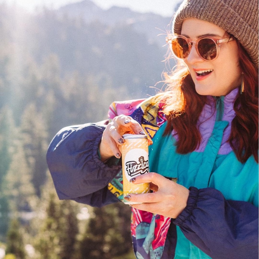
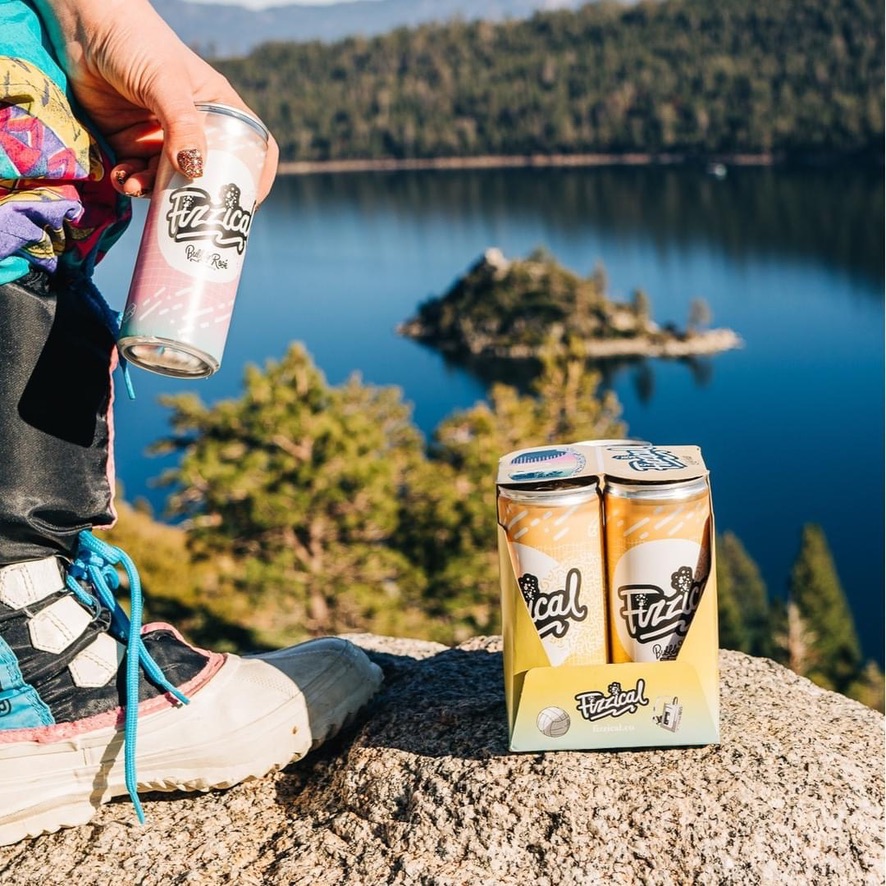
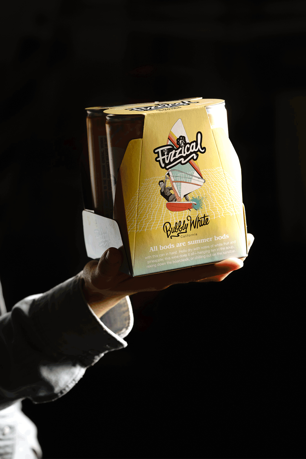
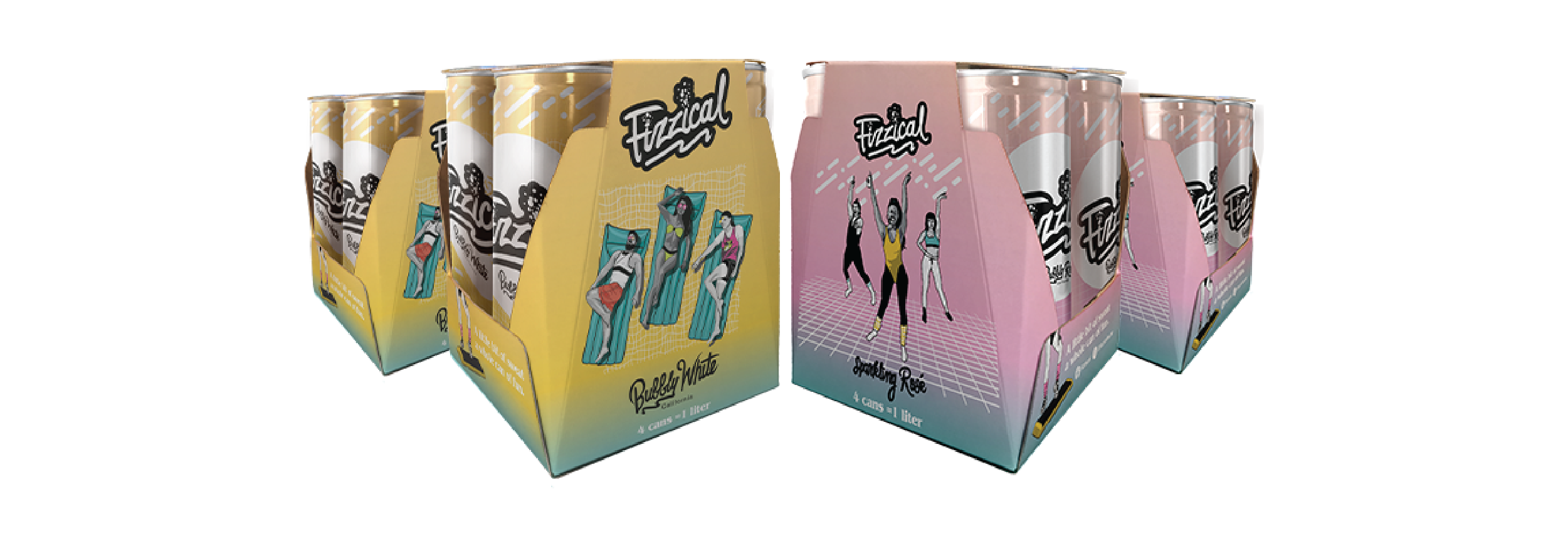
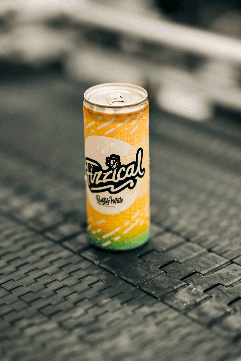
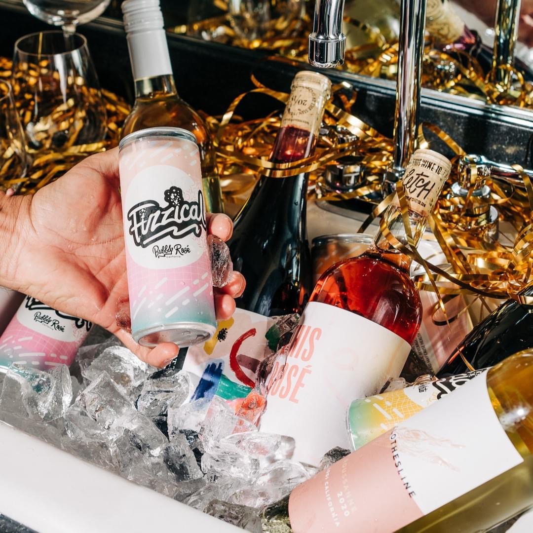
Fizzical is a bold, unapologetically fun canned wine brand I created while developing concepts for eStCru. Inspired by ‘80s fitness culture, disco energy, and my mom—a true dance floor legend—Fizzical celebrates small wins and leans hard into nostalgia. Think neon colors, bubbly puns, and a can that practically moves on its own.
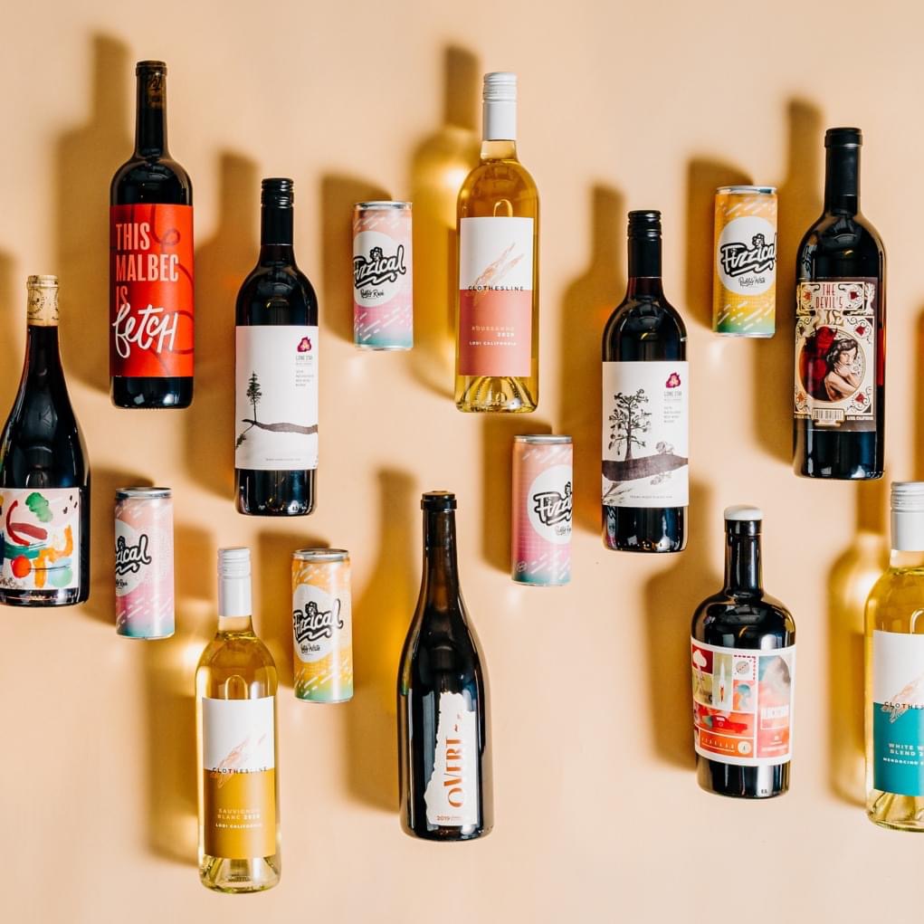
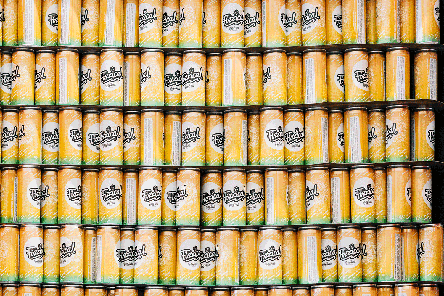
Designed to stand out in a saturated DTC market, the brand needed to be eye-catching, energetic, and scroll-stopping. Where competitors leaned minimal and chic, we went all-in on character and camp. I hand-lettered the logo with retro flair and added fizzing bubbles to drive the pun home. The visual system pulls from Memphis Group patterns, TAB soda aesthetics, and vintage gym gear.
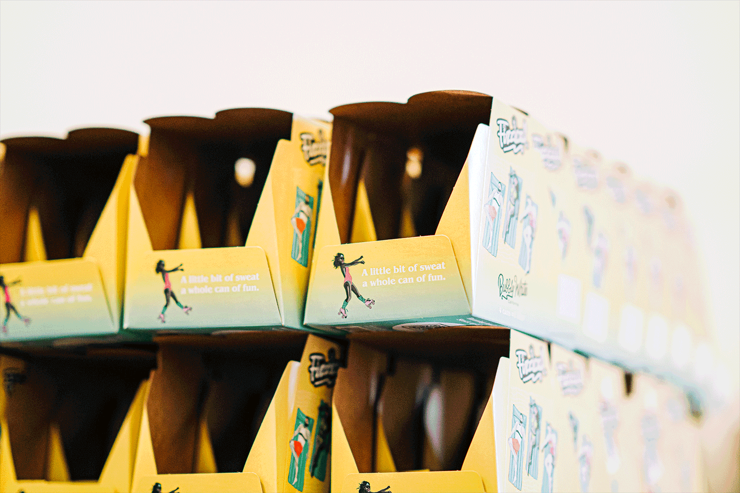
To bring the brand to life, I illustrated a cast of real-bodied, diverse characters—based on friends—posed like vintage yearbook athletes. These playful personalities carried across packaging, social ads, and a landing page built for impulse buys. From shelf to scroll, Fizzical serves color, humor, and a throwback vibe that’s impossible to ignore.
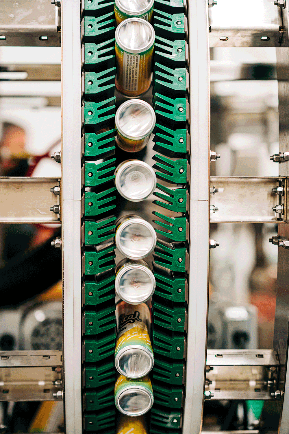
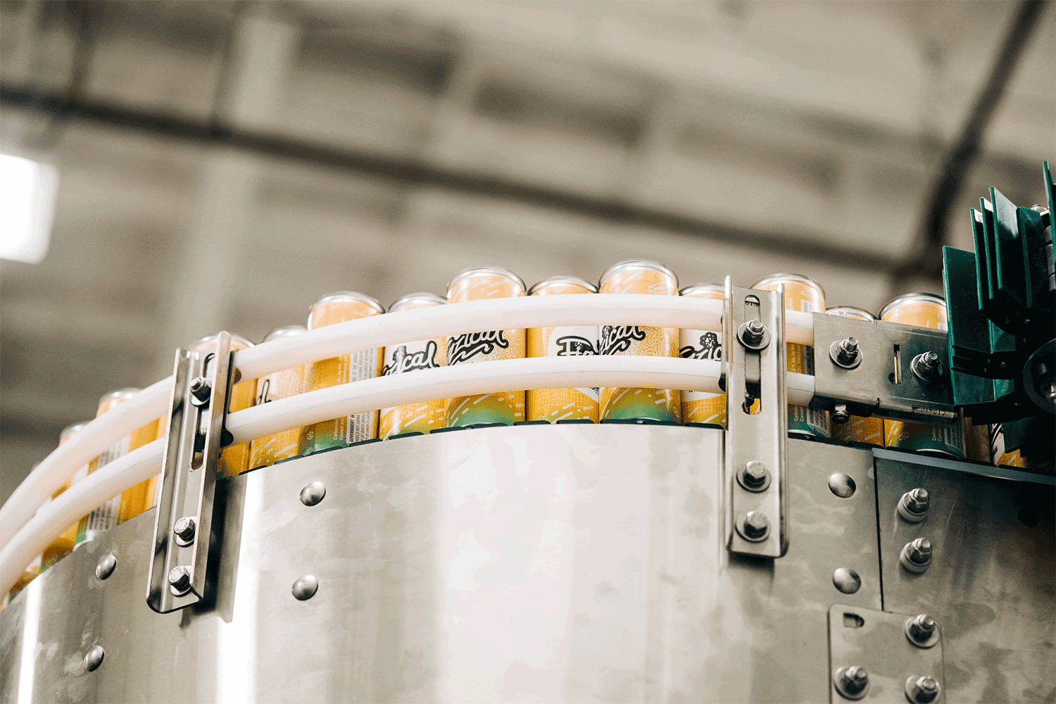
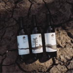
Photography by Anna Wick