BRANDING
eStCru — Brand Identity
California | Brand Designer
When creative agency eStreet.co was offered grapes by a vineyard in exchange for their services, they saw an opportunity to do something bold—create their own wine brand. That spark of inspiration became eStCru, an umbrella brand designed to house a wide variety of wines, from everyday table blends to premium, small-batch releases.
The challenge was to create a brand identity that could flex—looking just as at home on an $8 bottle as it would on a $75 reserve. The logo needed to be elegant, scalable, and subtle enough to let each sub-label shine, while still standing confidently on its own across barrels, boxes, and collateral.
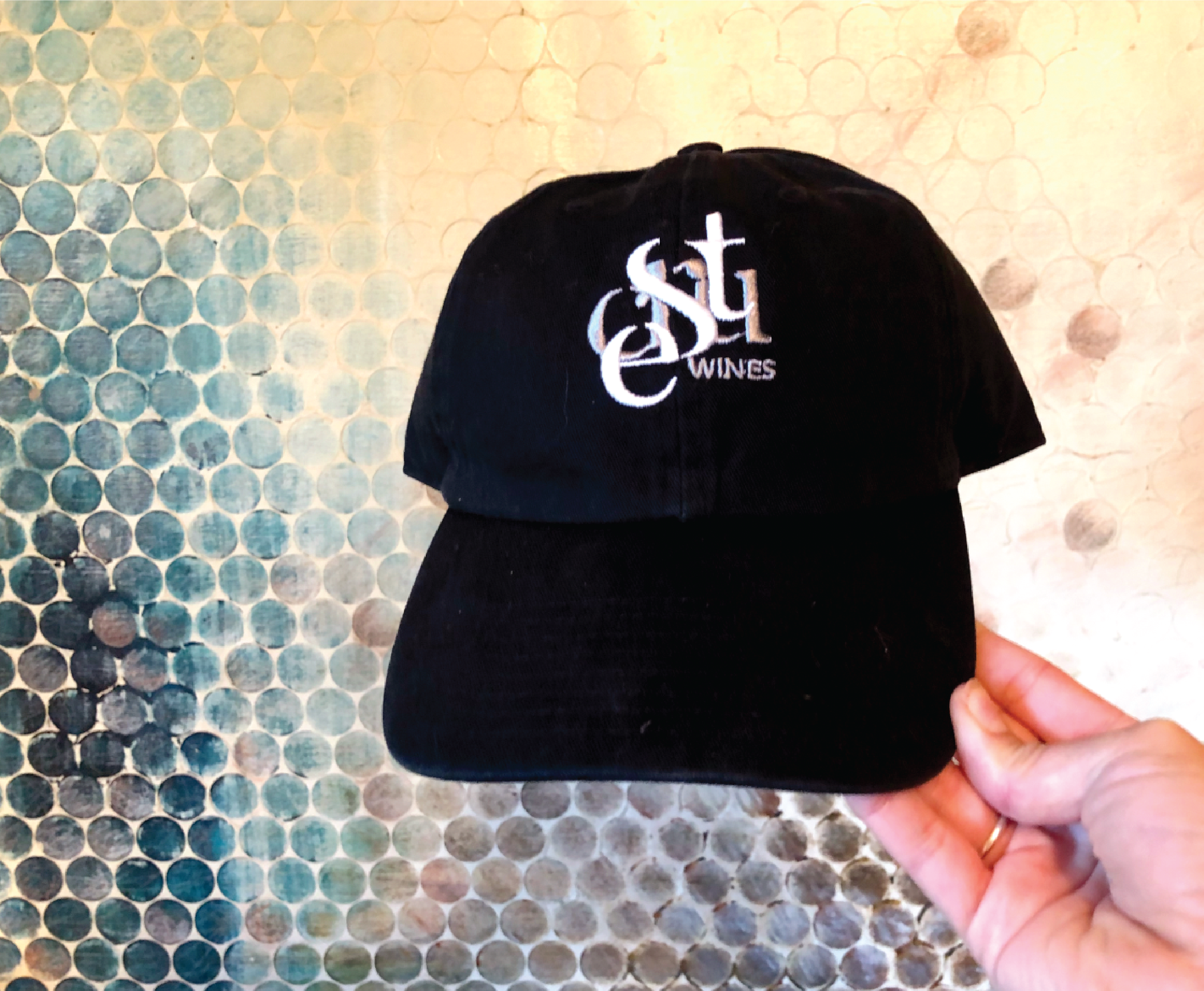
I explored a purely typographic approach, focusing on the unique interplay between the lowercase and uppercase characters in “eStCru.” The final mark balances the dual nature of the brand: approachable yet elevated, modern but rooted in tradition. With clean lines and a single-color option, the logo adapts seamlessly across packaging, labels, and large-format applications.


