B2B2C | BRANDING
Balancing Care + Credibility:
A Dual-Brand Strategy
Upwards serves a wide range of users—from parents looking for child care to HR leaders at Fortune 500 companies. As the brand evolved, it became clear that one visual language couldn’t speak effectively to both.
Our early branding leaned heavily into childlike illustration and soft pastels—approachable for families, but not aligned with how we needed to show up in the corporate benefits space.
We didn’t need one brand that did everything. We needed two complementary expressions of the same brand—each tailored to its audience, but built from the same foundation. This approach would let us meet parents where they are and earn trust in boardrooms.
The Approach:
I designed a dual-branding system:
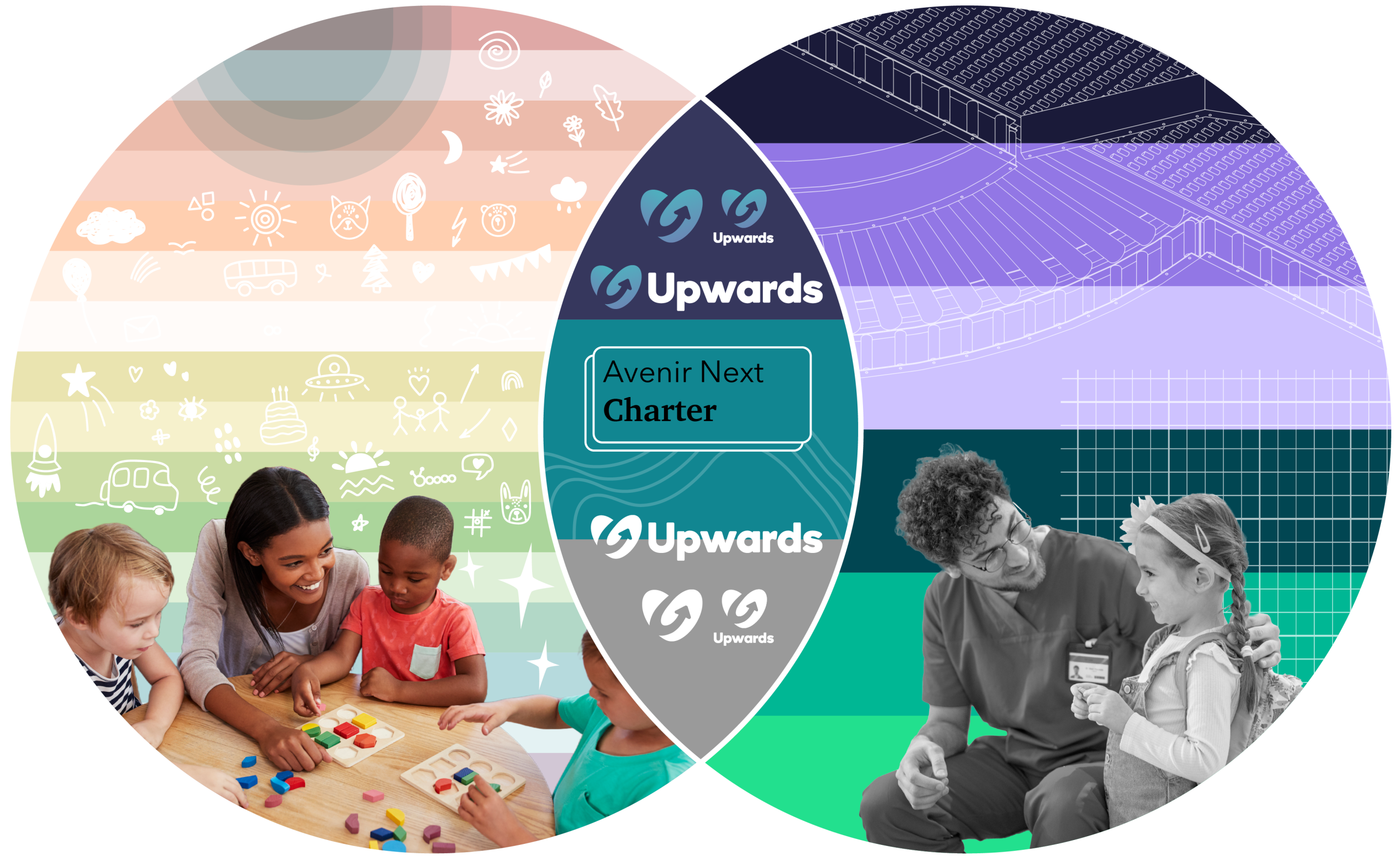
For Parents & Providers:
I kept the soft, playful style—rounded shapes, pastel colors, and friendly illustrations—to maintain warmth and approachability.
For Employers & Government:
I leaned into a more polished, tech-forward look—deeper tones, sharp layout systems, editorial typography, and iconography with more structure and clarity.
The Outcome

This dual-brand approach gave our teams clarity and creative flexibility. It allowed us to speak credibly to corporate and government partners without alienating the families at the heart of our mission.
It also laid the foundation for high-impact, enterprise-facing materials—like our first white paper, A New Era in Child Care. Designing that piece required a more editorial, refined tone, and the groundwork we set with this system made that pivot seamless. Instead of watering down the brand, we sharpened it—building trust on both sides of the conversation.
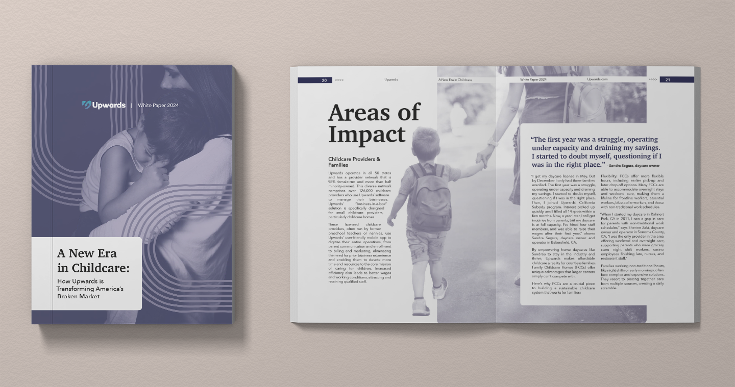
You can read the full white paper here.